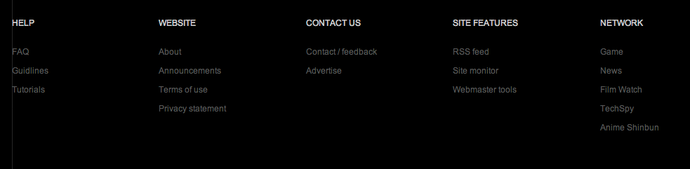
Custom HTML elements
- Written by: Super User
- Published in Template articles
- Hits: 1279
Columns
Columns needs main wrapper with gkCols class and data-cols attribute:
<div class="gkCols" data-cols="2">
<div>
First column content
</div>
<div>
Second column content
</div>
</div>
You can create a layout with 2-5 columns using this structure.
Newsletter
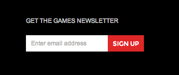
The newsletter custom HTML code is a structure for very simple newsletter form:
<form action="#" class="gk-newsletter">
<p><input type="email" placeholder="Enter Email Address"> <input type="button" value="Join"></p>
</form>
As you can see it uses the form element with gk-newsletter CSS class, and two basic input fields.
Social icons
Social icons have a very simple structure based on links placed in the container with gk-social class:
<div class="gk-social">
<a href="#" class="gk-twitter">twitter.com/game</a>
<a href="#" class="gk-facebook">facebook.com/game</a>
<a href="#" class="gk-youtube">youtube.com/game</a>
<a href="#" class="gk-gplus">plus.google.com/+game</a>
</div>
Banners
If you want to create a banner inside the inset column, please use the following syntax:
<a href="#" class="gkBanner"><img src="/templates/2013_12/images/demo/banner_inset.jpg" alt="Banner"></a>
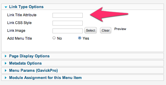
Page Title
The page title element is created from the active menu item title attribute, or if it is blank - from the menu item name:
If you want to disable the page title totally or on the specific pages - you can use the following options in the template "Features" settings:
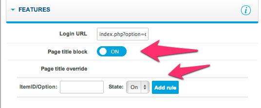
Please remember that you can: enable page title on the specific pages or disable page title on the specific pages. Of course without adding rules for the specific menu items or components you can enable/disable page title for all pages.